How to Get Your Website Traffic to Convert to a Paying Customer
)
Are you getting traffic to your website but have no conversions or your conversions you are getting aren't improving? Have you re-designed your website, put up more content, and still not seeing enough improvement in conversions? It's great to see lots of traffic coming into your website; this is usually an indicator your marketing efforts are working efficiently. Having traffic to your site is one thing, but the primary end goal in bringing traffic to the site is to convert this traffic into a paying customer. If you're receiving sufficient traffic but aren't seeing the same positive results in conversions, there can be several reasons this is happening.
First, it depends what sort of conversion you're looking for. Are your goals to increase leads or increase sales? It is important to narrow down what your goal is because they'll need to be addressed in different manners. While you keep in mind your goal, there are some troubleshooting steps to go through first to see if any of these are affecting your conversion rates.
First step: Let's look at how fast your website page is loading
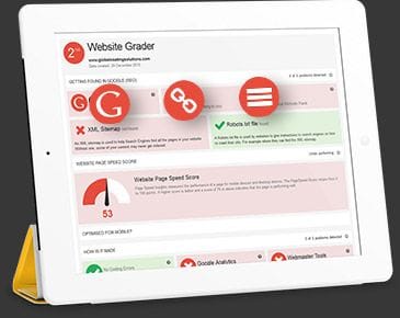
When someone visits your website, their first impression of you is how long your website takes to load. Seems like a trivial thing to be concerned about, however, it's been proven if a website takes more than 3-5 seconds to load, you can expect up to a 40% bounce rate - that's a lot of potential clients that won't even look at your website. If your website is loading slow, it will impact how many visitors you get - if your traffic is good, this might not be an issue, but it's worth considering anyway!
If you want to learn about website speeds, you can read more on our blog: Is Your Website Up to Speed?
Next step: Read over your copy
When you're going through your copy, ask yourself: does this add value to potential clients? Are you giving them answers to their problems? For example, if you're a HVAC business offering same day maintenance, does your copy say "we do this"? If so, you should consider altering with a different message. To add value and solutions to your clients, copy should instead say: "if you need this, our particular service solves your problem". It's important to reaffirm to visitors that you have the solution they're looking for to make sure they don't leave the page, and also to encourage conversions. This way, you're still saying "we do this" but in a manner that addresses the problem the client was intentionally seeking to solve.
Third step: Analyze the placements of your call-to-actions
A call-to-action is a simple way to get people to take the next step on your website; an effective call-to-action gives the user a clear direction to what you want them to do, ultimately helping you achieve your business objectives. It helps improve leads, raise profit margins and reach your goals faster.
A CTA can be any of the following:
- Buy now/add to cart buttons
- Free Quote Button
- Places to sign up for subscriptions
- Social media share buttons
- Read/learn more button/link
- Claim your free trial/free consultation
- Call now button
- Form submission
What makes a profitable CTA?
- Strategically located - visible and where the eye is naturally drawn to
- Well sized with clear font and easy to read
- Brightly coloured - or a colour that stands out from the homepage
- There should be CTA's on all pages of your website
If you want advice on your CTA's or help implementing them in a different way, the team at Bloomtools can help you.
Now you've covered the troubleshooting steps to see if they make a difference to your results, it's time to think again about what your goal is: lead conversions or sales conversions.
Tips For Improving Lead Conversions
Say your goal is to get more people to subscribe to your newsletter, enter your competition or submit a feedback form. As mentioned above, a call-to-action is vital in any area you want people to convert. Think about where your CTA is placed: is it clear on the page? Does it tell potential clients exactly what you want them to do? Are you ensuring your clients there's no commitment if there isn't one? Is the messaging enticing enough? Your answers to these questions can indicate what steps you can take first to get started. It's also important to guarantee their information won't be used or sold for spam purposes. Additionally, if you're offering a free trial, make sure it's clear they'll get the solution they're searching for by following through with the trial.
Tips For Improving Sales Conversions
When attempting to improve your sales conversions, it's a little bit more of a test and analyze the results method. There's no method guaranteed to work, so you have to test and see which ones are most appealing to your audience - it's also dependent on what your end goal for conversions is. But, the good news is there's plenty of approaches you can take. Depending on your business's product or service, some of these may be more suitable for you than others. We've put some potential ideas into a simple list below:
- If you have a money-back guarantee offer, ensure this is visible near the add to cart CTA
- Make it clear to the user they're supporting a local business
- If you offer free shipping, make that clear. Add it to the header of all page and/or even the footer
- Include trust symbols such as compliance certificates, security awards, customer reviews, awards or honours won and any partners
- Use phrases as "while stocks last" or "limited stock left" to elicit action
- During the checkout process, if you offer discount codes, make sure the option to include one of those is visible
- Use high quality images only
- Keep it simple: overloading the page with too much will be confusing and off putting to any user and potentially divert them from completing the conversion process (while it's helpful to have or test out a variety of these options, it's also important to find the right balance and not do "too much" on one page)
Now you've got all the steps and ideas needed to give your website a review and think of which of these tools could help improve your outcomes. It's time to start testing out new tools and get your traffic converting. If you're interested in implementing any of the aforementioned conversion strategies or want to know more, feel free to call us at on 1-844-448-6657 for more information, or book a consultation today with one of our internet marketing specialists. We're happy to help.
| Tags:Lead Generation |


)
)
)
